Seafoam to Sandy Beige: The Coastal Color Trends Defining Dunedin Homes
Dunedin, Florida, is more than just a location; it's a lifestyle. Nestled on the sun-drenched Gulf Coast, our charming city boasts a unique blend of Scottish heritage, artistic spirit, and laid-back coastal living. From the unspoiled beaches of Honeymoon Island to the vibrant downtown, the visual landscape is a constant source of inspiration. This inspiration, naturally, finds its way onto the walls and exteriors of our homes. The color palette of a Dunedin home is a reflection of its surroundings—a story told in hues of sea, sand, and sky.
But which colors truly capture the essence of Dunedin living in 2024 and beyond? The trends are moving beyond simple whites and blues. They're becoming more nuanced, sophisticated, and deeply connected to our local environment. Here at Dunedin House Painting Company, we've had our brushes in every shade imaginable, and we've seen firsthand the colors that make a house feel like a coastal sanctuary. This guide will walk you through the defining coastal color trends for Dunedin homes, from serene seafoams to earthy sandy beiges, helping you choose the perfect palette for your personal paradise.
The Heart of Dunedin's Coastal Aesthetic
Before diving into specific colors, it's crucial to understand the 'why' behind Dunedin's aesthetic. Unlike the electric pastels of Miami or the formal neutrals of Naples, Dunedin's style is relaxed, authentic, and nature-driven. It’s about creating a seamless transition between the outdoors and indoors. Think about the soft, hazy light of a Gulf morning, the weathered texture of driftwood on the shore, and the brilliant flash of a roseate spoonbill against the mangroves. These are the elements that inform our local color story.
The goal is not to mimic a beach-themed gift shop, but to evoke a feeling of calm, connection, and effortless elegance. It’s about colors that feel clean and airy, that stand up to our brilliant Florida sun without fading, and that complement the lush greenery of our subtropical landscape. The current trends lean towards palettes that are both timeless and deeply personal, reflecting the natural beauty that makes our city so special.
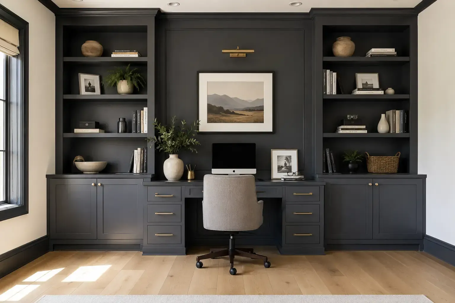
Deep Dive: Top 5 Coastal Color Palettes for Your Dunedin Home
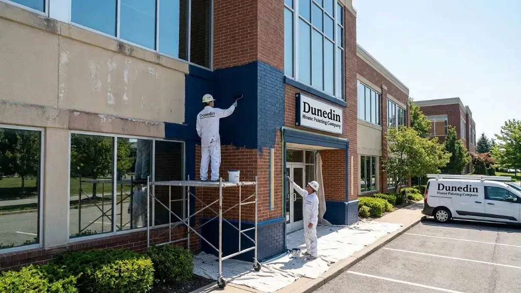
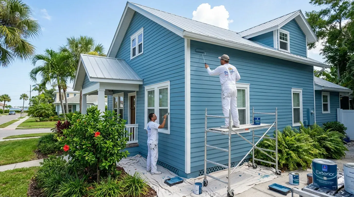
Choosing a color is a significant decision, one that impacts your home's curb appeal and your daily mood. Our team has curated the top five color trends we see making a splash across Dunedin, from historic bungalows to modern waterfront estates. Explore our full range of painting services to see how we can bring these palettes to life for you.
1. The Caladesi Collection: Whispers of Seafoam & Aqua
Named after the pristine, untouched shores of Caladesi Island State Park, this palette is the quintessential coastal look, reimagined with more subtlety and sophistication. It’s less about bright, saturated turquoise and more about the soft, muted greens and blues found where the water meets the sky.
- Key Colors: Seafoam green, pale aqua, muted teal, sea salt white.
- The Vibe: Serene, calming, and airy. This palette creates a spa-like retreat, perfect for bedrooms, bathrooms, and living spaces where relaxation is key.
- Exterior Use: A pale seafoam or aqua can make a stunning and unique exterior body color, especially for bungalows or Key West-style homes. It pairs beautifully with crisp white trim and a natural wood or soft gray door.
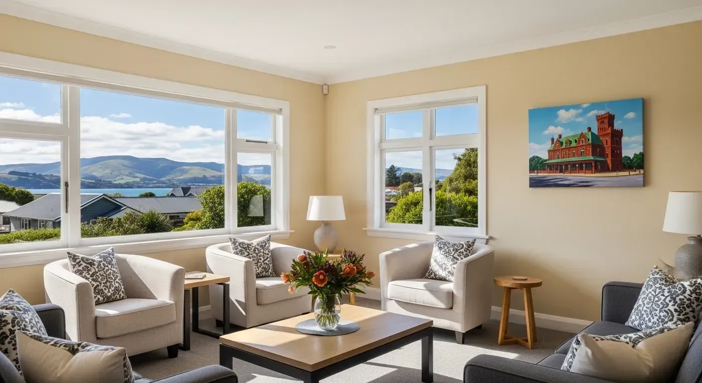
- Interior Use: Use a shade like Sherwin-Williams' "Sea Salt" in a living room for a color that changes with the light, shifting from green to blue to gray. It’s a versatile neutral that feels anything but boring.
- Pro Tip: To keep these colors from feeling too cold, introduce warmth through natural textures like rattan furniture, jute rugs, and warm wood tones.
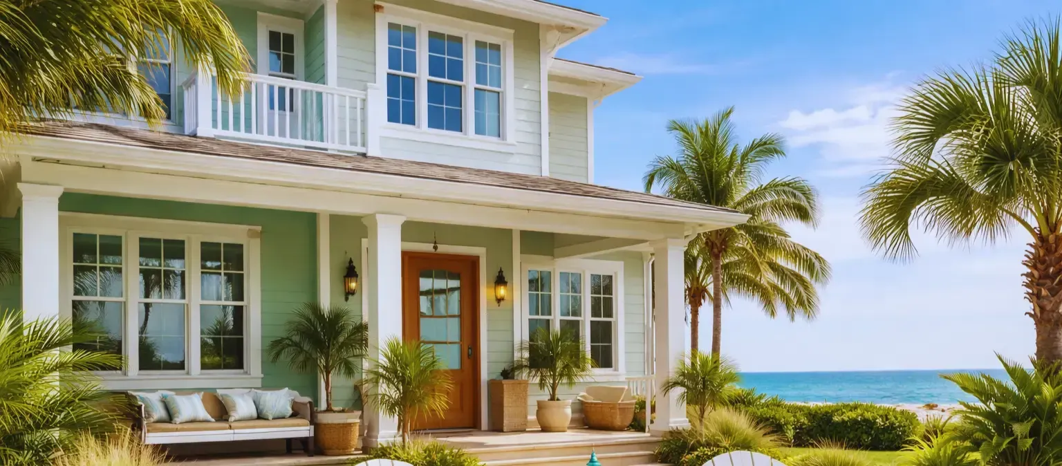
2. The Honeymoon Island Palette: Sandy Beige & Warm Whites
Walk the shores of Honeymoon Island, and you'll see an endless spectrum of warm, earthy neutrals. This palette captures that sun-drenched, sandy feeling, creating a foundation that is both incredibly versatile and deeply comforting. This isn't the sterile beige of the past; it's complex, warm, and inviting.
- Key Colors: Sandy beige, greige (a mix of grey and beige), oyster shell, creamy off-white.
- The Vibe: Grounded, organic, and sophisticated. It provides a perfect, light-filled backdrop for any style of decor, from modern minimalist to rustic coastal.
- Exterior Use: A warm, sandy beige is a timeless choice for a Dunedin exterior. It complements our lush green lawns and tropical foliage and looks stunning against the blue Florida sky. Consider Benjamin Moore's "Manchester Tan" for a classic look.
- Interior Use: An all-over greige like Sherwin-Williams' "Accessible Beige" creates a cohesive flow throughout the home. It allows your art, furniture, and views to take center stage while still providing a warm, enveloping feel.
- Pro Tip: The key to making a neutral palette interesting is texture. Layer in linen curtains, chunky knit throws, and live-edge wood tables to create visual depth and interest.
3. The Sunset on the Causeway Collection: Muted Corals & Sun-Washed Terracottas
Anyone who has watched the sun dip below the horizon from the Dunedin Causeway knows the spectacular display of color that follows. This palette captures those fleeting moments of beauty, translating them into warm, optimistic, and energetic hues that feel both bold and natural.
- Key Colors: Dusty rose, muted coral, sun-washed terracotta, soft peach.
- The Vibe: Cheerful, welcoming, and unique. These colors bring a dose of personality and warmth to any space.
- Exterior Use: While a full terracotta exterior might be bold, these colors are perfect for front doors, shutters, or even a feature wall on a covered lanai. A peachy-pink door on a crisp white or sandy beige house is pure Dunedin charm.
- Interior Use: Use a muted coral as an accent wall in a dining room or office to inspire creativity and conversation. In a bedroom, a soft, dusty rose can feel incredibly romantic and soothing.
- Pro Tip: Balance these warmer tones with cool neutrals like light gray or crisp white to keep the look sophisticated and not overwhelming. Brass and gold hardware also pair beautifully with this palette.
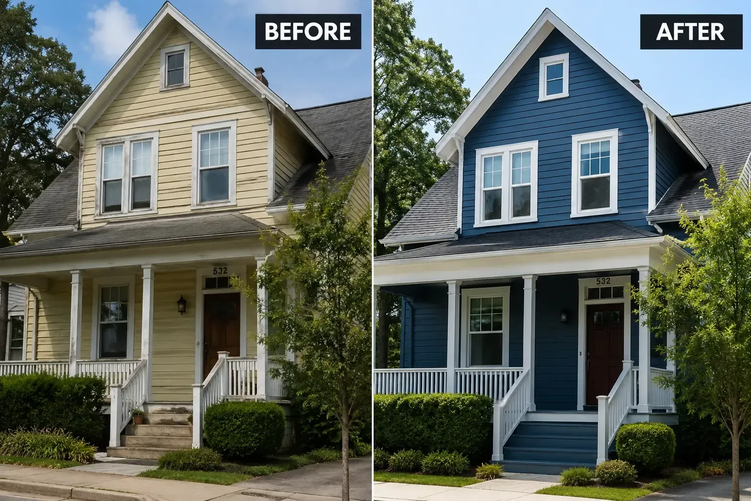
4. The Marina Mood: Classic Nautical Blues & Crisp Whites
A timeless classic for a reason, the nautical palette is deeply ingrained in coastal living. Inspired by the sailboats in the Dunedin Marina, this trend is all about clean lines, high contrast, and a sense of enduring style. The 2024 update involves using deeper, more complex blues and pairing them with the right shade of white.
- Key Colors: Deep navy, slate blue, denim blue, and a clean, true white (not creamy).
- The Vibe: Crisp, clean, and classic. This high-contrast look feels both traditional and modern, depending on how it's styled.
- Exterior Use: A deep navy blue like Sherwin-Williams' "Naval" is a showstopper for an exterior, especially when paired with brilliant white trim. It exudes confidence and has incredible curb appeal. It's also a fantastic choice for front doors and shutters on a white or light gray home.
- Interior Use: Create a dramatic feature wall in a living room with a deep navy, or paint kitchen island cabinets this shade for a pop of sophisticated color. In smaller doses, it can be used in textiles and decor to add a nautical touch without overwhelming the space.
- Pro Tip: To avoid a theme-park look, use nautical motifs sparingly. The color palette itself is powerful enough. Focus on high-quality materials and clean lines to keep it feeling elevated. Learn more about us and our philosophy on timeless design.
5. The Pinellas Trail Patina: Weathered Grays & Driftwood Tones
This palette draws inspiration from the natural, weathered elements found along our beloved Pinellas Trail—the silvered wood of old fences, the smooth gray of stones, and the soft tones of the coastal flora. It's a more organic, rustic take on coastal that feels incredibly calming and connected to nature.
- Key Colors: Light driftwood gray, charcoal, greige, and earthy taupe.
- The Vibe: Restful, natural, and minimalist. This palette is for those who love the coast but prefer a more understated and modern aesthetic.
- Exterior Use: A light to mid-tone gray is a hugely popular and versatile exterior color. It works with almost any architectural style found in Dunedin and acts as a perfect backdrop for landscaping. Benjamin Moore's "Revere Pewter" is a fan favorite for its chameleon-like ability to look great in any light.
- Interior Use: Create a serene, monochromatic look by layering different shades of gray and taupe. This works beautifully in a master bedroom or a minimalist living space. It allows the texture of materials—wood grain, stone, metal—to become the primary design element.
- Pro Tip: To keep a gray-dominant palette from feeling flat, ensure you have plenty of natural light and introduce pops of green through houseplants. The contrast between the soft gray and vibrant green is stunning.
Choosing the Right Finish for Dunedin's Climate
The color is only half the battle; the paint's finish (or sheen) is critical, especially in our humid, sunny climate. A high-quality finish not only affects the final look but also provides crucial protection against moisture, mildew, and UV fading.
| Finish Type | Best For | Pros in Dunedin | Cons |
|---|---|---|---|
| Flat/Matte | Interior ceilings, low-traffic walls | Hides imperfections well | Difficult to clean, not durable for exteriors |
| Eggshell/Satin | Most interior walls, exterior siding & body | Great balance of durability and low sheen. Resists moisture and mildew. Easy to clean. | Can show some imperfections more than flat |
| Semi-Gloss | Trim, doors, kitchen/bath walls, shutters | Highly durable, very easy to clean, excellent moisture resistance. | High sheen highlights every flaw on the surface |
| High-Gloss | Front doors, high-impact details | Maximum durability and shine, creates a statement. | Requires perfect surface prep; very unforgiving |
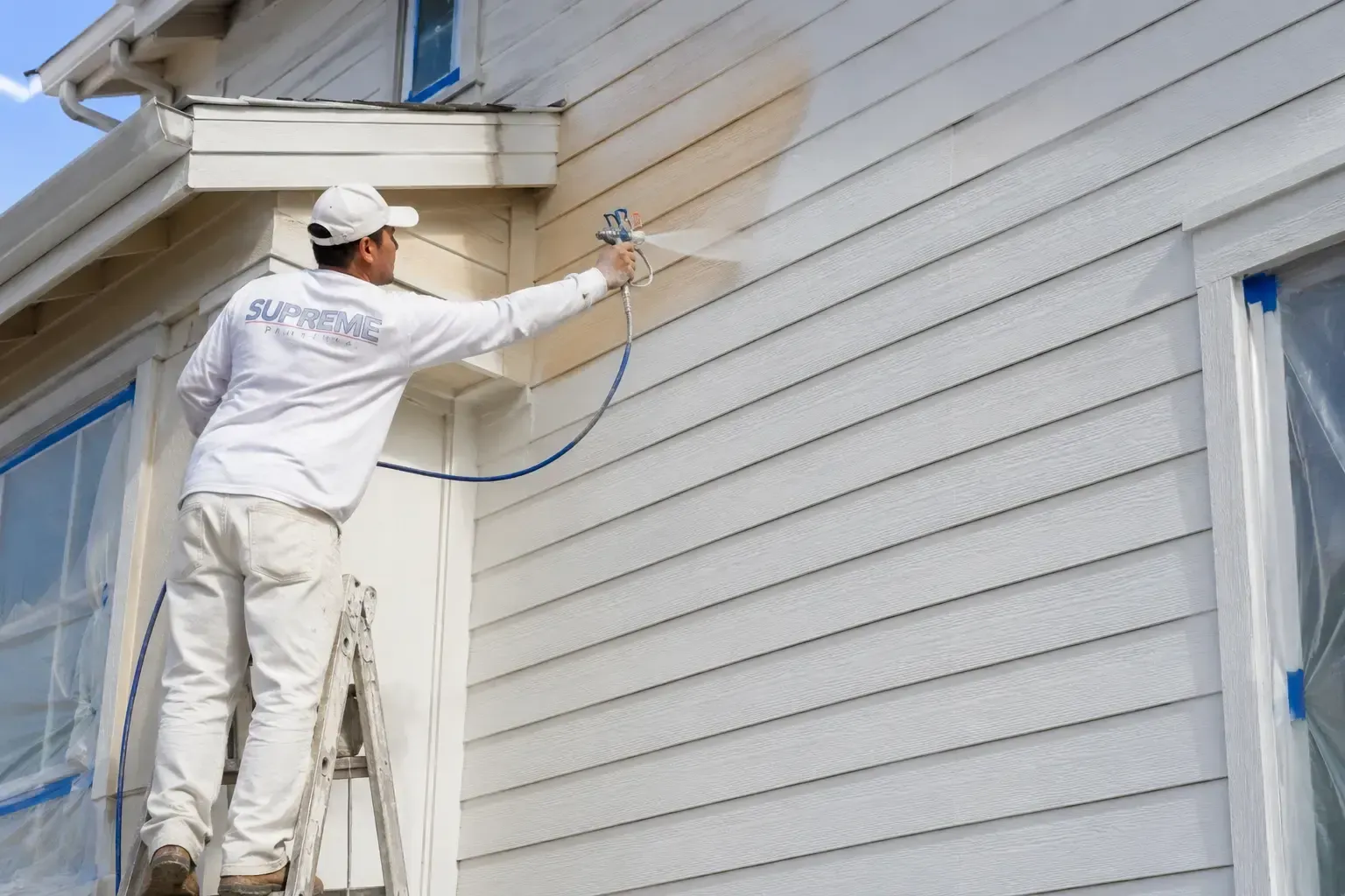
For most Dunedin exteriors, we at Dunedin House Painting Company recommend a high-quality satin finish for the body and a semi-gloss for the trim. This combination offers the best defense against the elements while looking fantastic.
Conclusion: Your Home, Your Coastal Story
The color of your home is your personal stamp on our beautiful city. Whether you're drawn to the tranquil blues of the Gulf, the warm neutrals of the sand, or the vibrant hues of a sunset, the right palette can transform your house into a home that truly feels like a coastal retreat. These trends are not rules, but inspiration—a starting point for you to create a space that reflects your love for the Dunedin lifestyle.
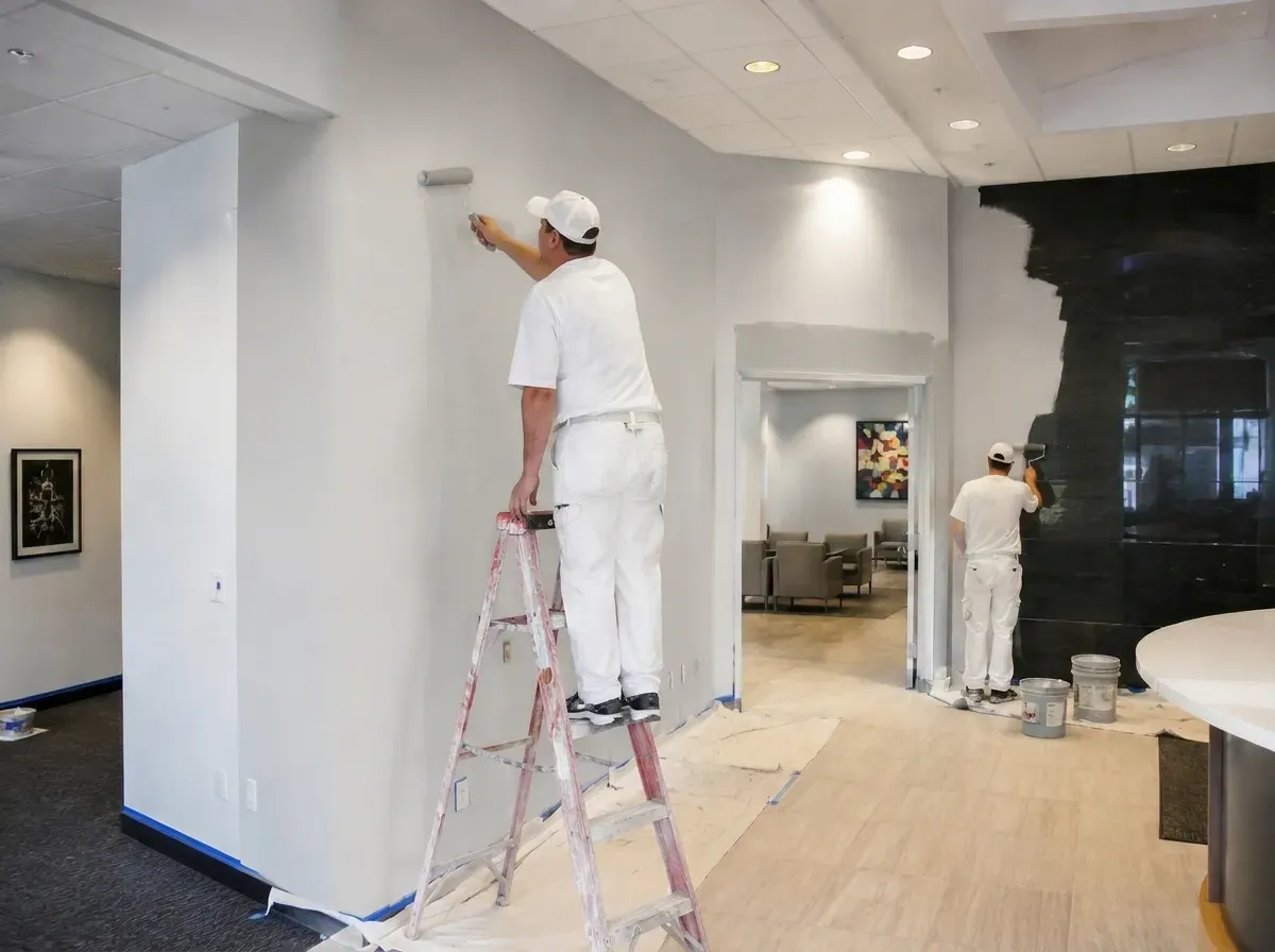
Taking on a painting project, especially an exterior one, is a significant undertaking. If you're ready to bring these coastal color trends to life with a professional, flawless finish, we're here to help. Explore our work, learn about our process, and when you're ready, contact us to start the conversation. Let's paint your piece of paradise.
Frequently Asked Questions
Q1: How do I choose the right exterior paint finish for Dunedin's humid climate?
A: In a high-humidity environment like Dunedin, performance is key. We recommend a 100% acrylic latex paint in a satin or semi-gloss finish. Satin is excellent for the main body of the house as it's durable, easy to clean, and resists mildew. For trim, doors, and shutters, a semi-gloss finish provides even greater durability and moisture resistance, which is perfect for areas that are frequently touched or exposed to rain.
Q2: What are some popular accent colors for a sandy beige house in Dunedin?
A: A sandy beige or warm white exterior is a fantastic canvas. For a classic coastal look, crisp white trim is timeless. To add personality, consider a front door in a muted aqua (like Sherwin-Williams' "Tidewater") or a deep nautical navy (like Benjamin Moore's "Hale Navy"). For a more natural look, a dark, weathered gray on the shutters can also be stunning.
Q3: Can I mix and match different coastal color palettes in my home?
A: Absolutely! The best designs often pull from multiple sources of inspiration. For example, you could use the warm, sandy beige palette as the main neutral throughout your home for a cohesive flow, and then introduce the seafoam and aqua collection in a bedroom or bathroom for a serene, spa-like feel. The key is to maintain a consistent undertone (either warm or cool) to ensure the palettes harmonize.
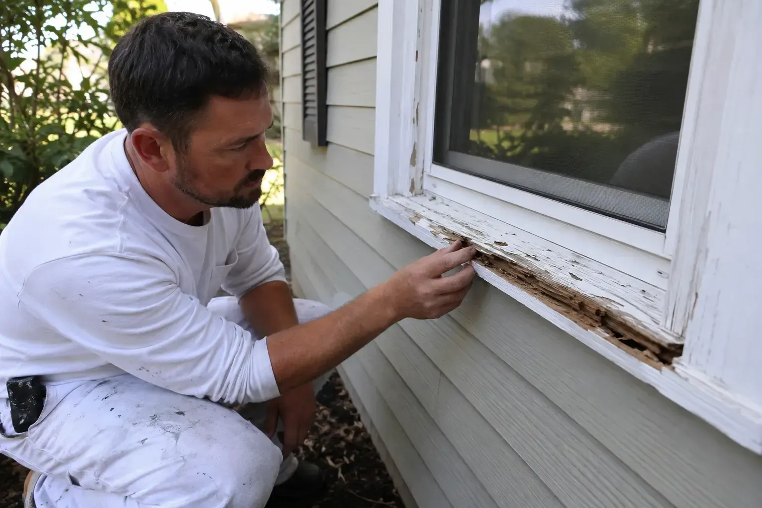
Q4: How often should I repaint my home's exterior in a coastal area like Dunedin?
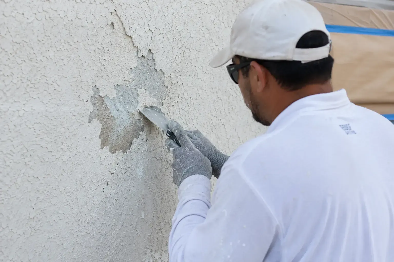
A: Due to the intense sun, high humidity, and salt in the air, homes in coastal Florida require more frequent painting than in other climates. A high-quality, professional paint job should last anywhere from 5 to 7 years. Regular pressure washing to remove dirt, salt, and mildew can help extend the life of your paint job. If you see signs of peeling, cracking, or significant fading, it's time to consider a repaint to protect your home's structure.