The Power of Paint: How Color Psychology Shapes Modern Interior Design
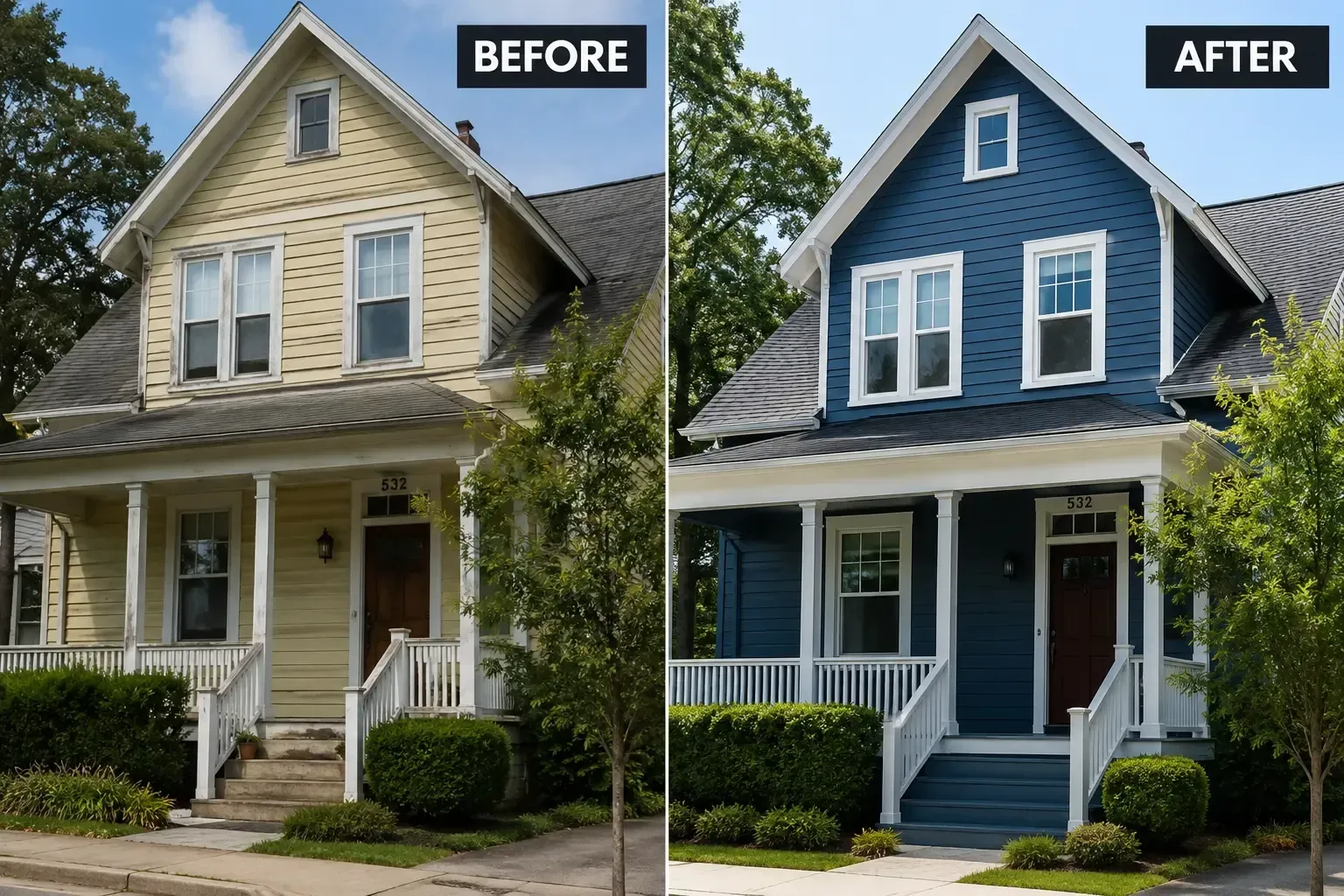
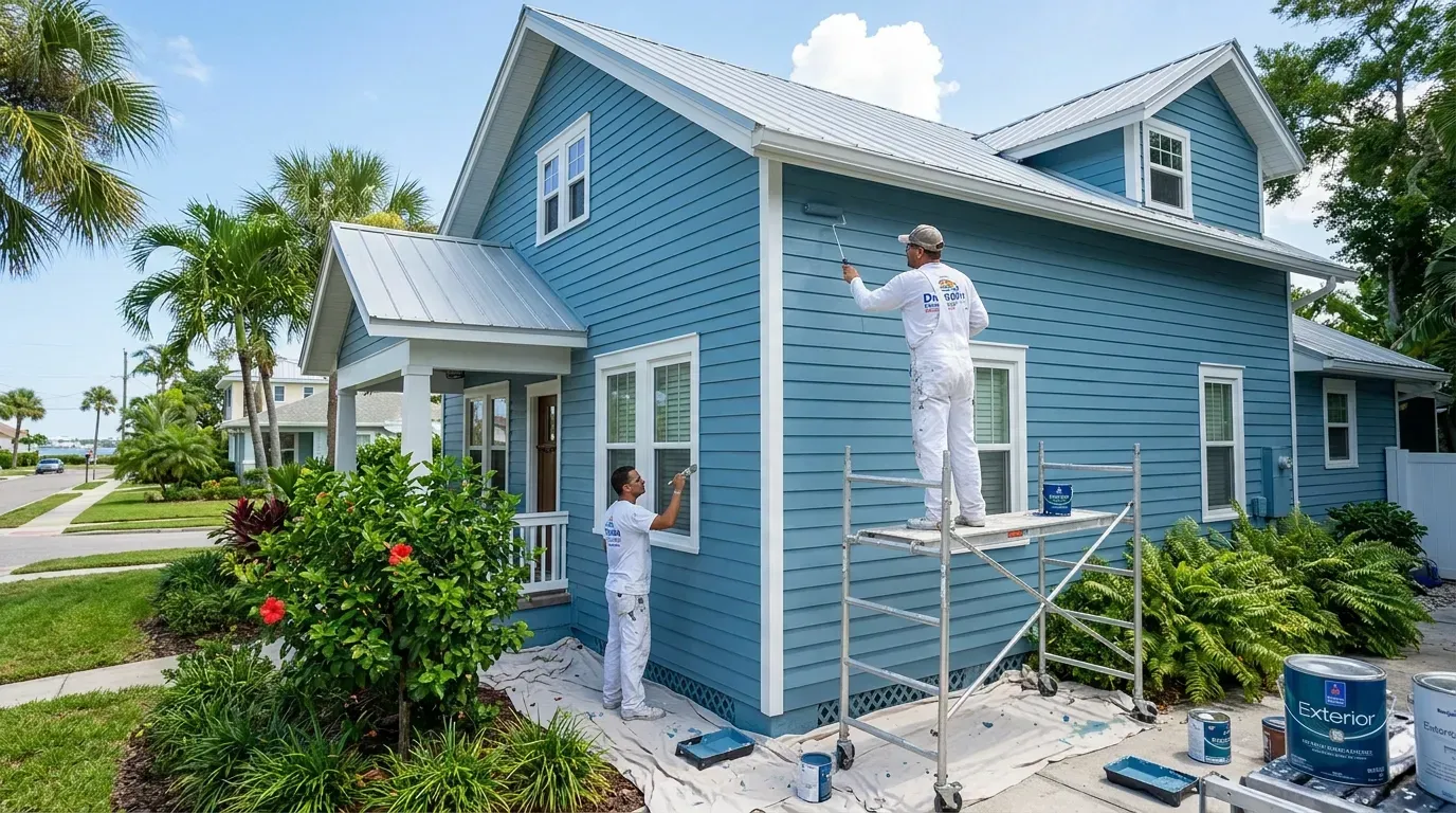
Choosing a paint color can feel like one of the most daunting decisions in home renovation. It's more than just a backdrop; it's the very essence of a room's atmosphere. The color on your walls can influence your mood, impact your productivity, and even affect your perception of space. This powerful connection between color and emotion is the foundation of color psychology, a field that has become an indispensable tool in modern interior design. Here at Dunedin House Painting Company, we've seen firsthand how a thoughtful color choice can completely transform a house into a home.
This comprehensive guide will explore the fascinating world of color psychology. We'll delve into how different hues impact our feelings and behavior, provide a room-by-room guide to selecting the perfect palette, and show you how to harness the power of paint to create a space that truly reflects and supports your lifestyle.
What Exactly is Color Psychology?
Color psychology is the study of how colors affect human behavior and emotion. While personal experiences and cultural backgrounds can influence our perception of color, there are some universal responses rooted in our shared biology and evolutionary history. For instance, the warm glow of a fire (reds, oranges, yellows) has been associated with comfort and energy for millennia, while the vastness of the sky and sea (blues) often evokes feelings of calm and stability.
In interior design, these principles are used to create specific moods and functional environments. A designer might use a calming blue in a bedroom to promote rest, a vibrant yellow in a kitchen to stimulate energy and conversation, or a sophisticated gray in a living room to create a chic, modern feel. Understanding these fundamentals is the first step toward making intentional and impactful design choices.
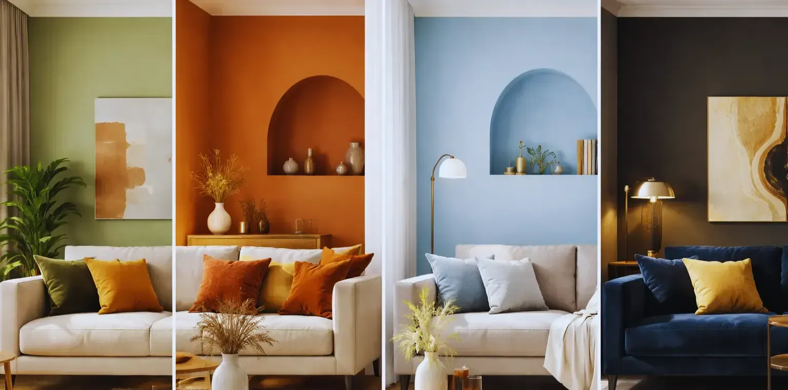
The Emotional Spectrum: A Deep Dive into Key Colors
Every color carries its own psychological weight. Let's break down the most common color families and the emotions they typically evoke.
Warm Colors: Energy, Passion, and Comfort
Warm colors are known for their ability to make a space feel cozier and more inviting. They are stimulating and often associated with happiness and high energy.
- Reds: The most intense color, red is associated with passion, energy, and excitement. It has been shown to increase heart rate and stimulate appetite, making it a bold choice for dining rooms or social spaces. However, its intensity means it's often best used as an accent color to avoid overwhelming a room.
- Oranges: A blend of red's passion and yellow's cheerfulness, orange is a color of enthusiasm and creativity. It's a great choice for a home office, a child's playroom, or any space where you want to encourage activity and innovation.
- Yellows: Symbolizing sunshine and happiness, yellow is an optimistic and uplifting color. It's perfect for kitchens, breakfast nooks, and entryways, as it creates a welcoming and energetic first impression. Softer yellows can be calming, while more vibrant shades are highly stimulating.
Cool Colors: Calm, Serenity, and Focus
Cool colors are known for their soothing and relaxing qualities. They can make a small room feel larger and more open, bringing a sense of peace and tranquility.
- Blues: Perhaps the most calming color, blue is associated with stability, serenity, and productivity. It's said to lower blood pressure and slow respiration. This makes light and mid-tone blues an ideal choice for bedrooms, bathrooms, and offices where focus is needed.
- Greens: Drawing its essence from nature, green is the most restful color for the human eye. It represents balance, harmony, and growth. Its versatility is unmatched; from deep forest greens to light minty shades, green works beautifully in living rooms, bedrooms, and virtually any space where you want to create a sense of renewal and peace.
- Purples: Historically associated with royalty and luxury, purple combines the stability of blue with the energy of red. Deep shades like eggplant exude drama and sophistication, while lighter shades like lavender and lilac are restful and serene, making them popular for bedrooms and creative spaces.
Neutral Colors: The Foundation of Design
Neutrals are the backbone of any color palette, providing a sophisticated canvas that allows other elements in the room to shine. Their power lies in their subtlety.
- Whites: Representing purity, cleanliness, and simplicity, white can make a room feel spacious and bright. The key is in the undertones; cool whites feel crisp and modern, while warm whites (with yellow or pink undertones) create a cozier, more inviting atmosphere.
- Grays: The quintessential modern neutral, gray is associated with sophistication, balance, and intellect. It's incredibly versatile, ranging from cool, almost-blue grays to warm 'greige' tones. It provides a stable and elegant backdrop for any design style.
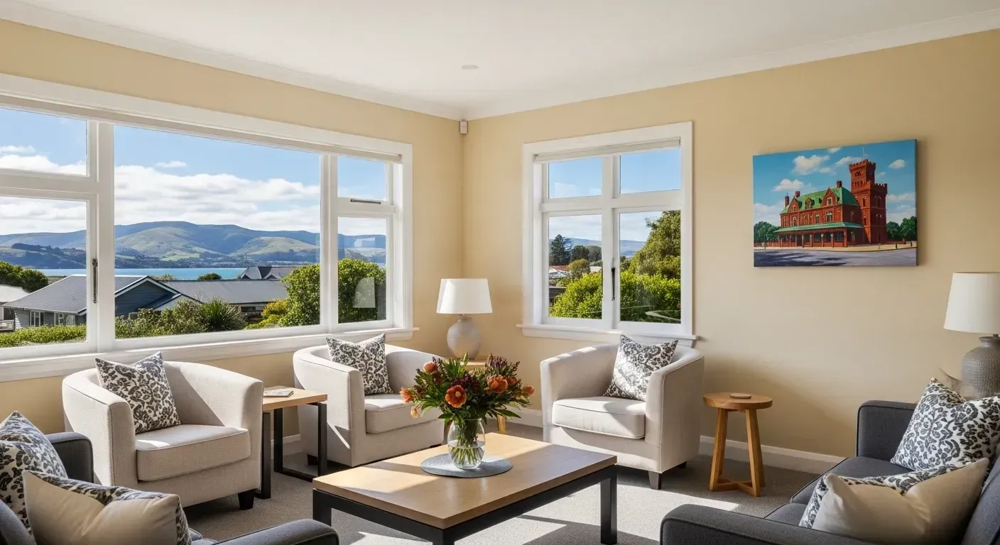
- Beiges: A dependable and comforting neutral, beige brings warmth and relaxation to a space. It's a classic choice that pairs well with a wide variety of colors and materials, creating a timeless and grounded look.
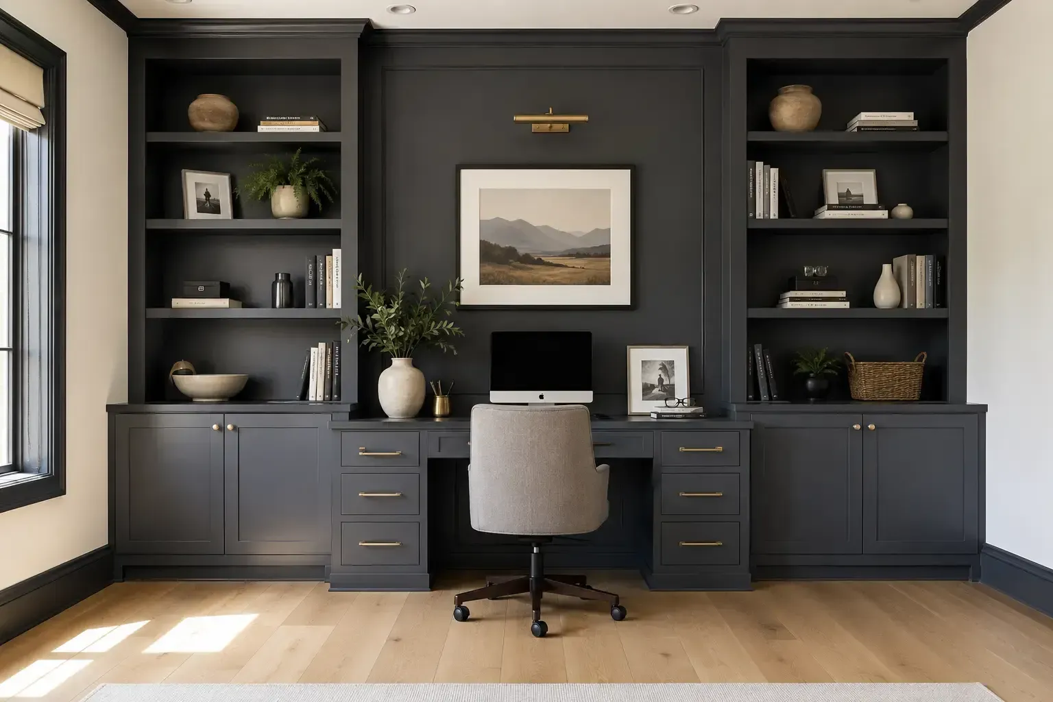
- Blacks: Powerful, elegant, and dramatic, black is best used as an accent. It can ground a color scheme, add a touch of sophistication, and make other colors pop. A black accent wall, trim, or door can create a stunning focal point.
Applying Color Psychology: A Room-by-Room Guide
Choosing the right color depends heavily on the function of the room. Our team at Dunedin House Painting Company always consults with clients on how they use a space before recommending a palette. Here’s a quick guide to get you started:
| Room | Primary Goal / Mood | Recommended Colors | Rationale |
|---|---|---|---|
| Living Room | Comfort, Socializing, Relaxation | Greens, Blues, Grays, Warm Neutrals | These colors promote conversation and relaxation. Use warmer accents to create a cozy, inviting atmosphere for guests. |
| Bedroom | Rest, Tranquility, Intimacy | Cool Blues, Greens, Lavenders, Soft Grays | These calming hues are proven to promote restful sleep. Avoid overly stimulating colors like bright reds or yellows. |
| Kitchen | Energy, Appetite, Cleanliness | Yellows, Whites, Light Blues, Greens | Yellows and reds can stimulate appetite, while whites create a sense of cleanliness. Blues and greens can add a fresh, calming touch. |
| Bathroom | Calm, Cleanliness, Spa-like Serenity | Soft Blues, Greens, Crisp Whites, Taupes | Mimic the colors of water and nature to create a relaxing, spa-like retreat. White enhances the feeling of cleanliness. |
| Home Office | Productivity, Focus, Creativity | Greens, Blues, Off-Whites, Deep Grays | Green and blue are known to enhance focus and efficiency. A neutral backdrop with a pop of an inspiring color like orange can boost creativity. |
Beyond the Walls: The 60-30-10 Rule and Paint Finishes
A successful color scheme is about balance. The 60-30-10 rule is a classic design principle that helps achieve this balance:
- 60% of the room should be a dominant color. This is typically your wall color.
- 30% should be a secondary color. This might be your upholstery, curtains, or an accent wall.
- 10% should be an accent color. This is for the small details: pillows, artwork, and decorative objects.
The paint finish also plays a crucial role. A matte finish has no shine and is great for hiding imperfections, creating a soft, modern look. An eggshell or satin finish has a slight sheen, is more durable, and is perfect for high-traffic areas. A semi-gloss or gloss finish is highly reflective and durable, making it ideal for trim, doors, and cabinetry.
Your Home, Your Color Story
While color psychology provides a fantastic framework, the most important factor is you. The colors in your home should make you feel happy, comfortable, and inspired. At Dunedin House Painting Company, our philosophy is to blend expert knowledge with your personal vision. We believe that the perfect color palette is one that tells your story.
Color is a deeply personal and powerful tool. By understanding its psychological impact, you can move beyond trends and create a timeless, beautiful, and emotionally resonant home. Whether you're looking for a calming sanctuary, an energizing creative space, or a sophisticated social hub, the right paint color is the perfect place to start.
Ready to transform your space with the power of color? Contact us today for a professional consultation and let our experts help you bring your vision to life.
Frequently Asked Questions
How do I choose the right white paint?
Choosing a white paint can be surprisingly complex. The key is to look at the undertones. Cool whites have blue, gray, or green undertones and create a crisp, clean look that's great for modern spaces. Warm whites have yellow, pink, or beige undertones and feel softer and more inviting, suiting traditional or cozy interiors. Always test a swatch on your wall and observe it at different times of the day to see how the light affects it.
Can the color of a room really affect my mood?
Absolutely. Numerous studies in color psychology have shown a strong link between color and emotion. Cool colors like blue and green can have a calming effect and lower stress levels, which is why they're recommended for bedrooms. Warm colors like yellow and orange can increase energy and optimism, making them suitable for social spaces. The effect is real and is a cornerstone of modern interior design.
What's the best way to test a paint color before committing?
Never rely on a small paint chip. The best method is to paint a large swatch (at least 2x2 feet) directly on the wall. Alternatively, paint a large piece of poster board and move it around the room. Observe the color in the morning, afternoon, and evening, as well as with artificial light on. This will give you the most accurate representation of how the color will look and feel in your space.
Should I paint my ceiling a different color than my walls?
While the standard is a flat white ceiling, painting it a different color can have a dramatic effect. Painting the ceiling a lighter color than the walls can make the room feel taller and more open. Painting it a darker color can make the space feel cozier and more intimate, but it can also make the ceiling feel lower. A bold color on the ceiling can be a fantastic design statement in the right room.